Contents
The Great Tricks in maximizing 1 Page Resume Template
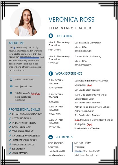
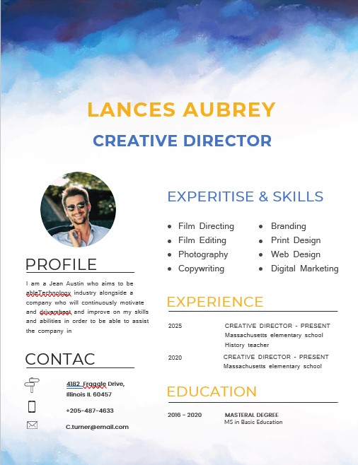
An attractive 1-page resume template will be very useful for those of you who work in the creative industry. Your job line and profile background will sparkle if you display it in a cool CV template. Then, is it perfectly effective to create a resume on one page only? And, what’s the trick to maximize your resume in just 1 page, but the design is still attractive? Come on, see the explanation!
Is it a must to write a resume on 1 page?
Writing an information-dense resume that demonstrates your qualifications is a must when applying for jobs. Whether you are an entry-level job seeker or an experienced job seeker, a resume that is up to two pages long, let alone three pages, can run the risk of thwarting your attempts to find a job.
- 10+ Daily Calendar Customizable PSD Design Template
- 10+ Price List PSD Flyer Template
- 10+ Graduation Announcement PSD Flyer Template
- 9+ Resume Template Free Download PSD
- 10+ Magazine Cover Template Free PSD
You may have a long list of internships and part-time jobs that you would like to write on your resume but are not really relevant to the job you are applying for. Even many mid-level job seekers and executives are advised to keep their resume on one page. The reason is, many HRDs have short attention spans.
Tricks to maximize 1-page resume template
Remove the word “Resume” or “Curriculum Vitae”
In general, applicants put the words “Resume” or “Curriculum Vitae” on the resume / CV page. However, if you want to make a 1-page resume template, you shouldn’t need to write that down anymore. Recruiters usually already understand that the file you provide is a resume. The thing to pay attention to is who you are and what is interesting. Make your name as a title with a clear font, but it doesn’t take up much space.
Shorten Contact Information
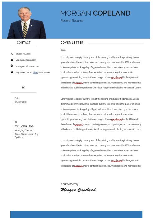
Your address does not need to take up a few lines in the CV. You don’t need to write in too much detail and complete, such as RT / RW information and the name of the province or country if you are applying for a company in the same city. In addition, there is no need to separate phone numbers, email addresses, and social media accounts on different lines.
School-level
Education at the tertiary level is generally more relevant in representing yourself. The rest, such as high school / vocational school level and back do not need to be included. Unless you’ve been to a certain school that makes your resume more outstanding. Organizational experience in high school is important, but this can be discussed during the interview session.
Relevant experiences or accomplishments
If you often won choir competitions in college, think again, is writing it on your CV can support your chances of being accepted in the job you want? If not, it’s a good idea to replace it with other experiences or achievements in accordance with the position you are applying
Section
Limit resume to 3-4 parts only. Combine sections such as “Skill and Interests”. If your achievements and interests vary widely, you can create an “Additional Information” section. Each new section means new headings, and these headings take up space. Come on, maximize every available space!
Spacing and font
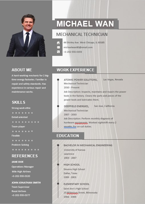
For font in a resume, you can try 11 or 11.5. It can leave more space without disturbing the view. Use a font that is easy to read. Spacing also needs attention. I think it’s a little risky if the margin is small, right? However, this can make your resume look more attractive. Try to make your margin 0.5 ”and see how much space you have.
Creativity
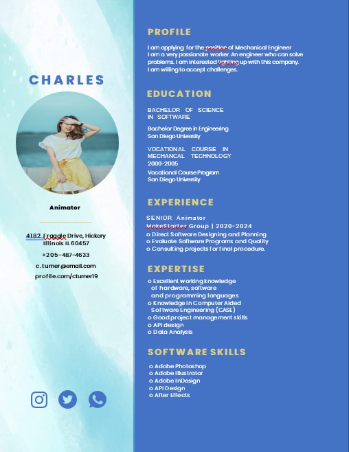
If your resume is concise, it’s time to beautify your resume! If you want to work in the design world, a creative resume is a must. However, that doesn’t mean those outside the design can’t try it. This could be a catcher for recruiters, you know. It doesn’t have to be full of design, the important thing is that it is neat and looks different from other resumes. So, create your 1-page resume template with those great tricks to get maximal results.
