Contents
How And When You Should Use Line Graph Template
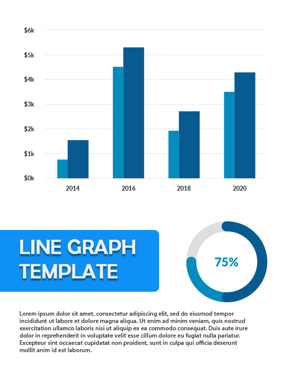
A line graph template used to show data in visual information that is easier to understand. Usually, the line graph used to track changes in a condition over a long period. When there is a small change in data, the line graph can show it more clearly.
When Should Use Line Graph Template?
A line graph is connected data types with a line to see the trend of the data. There are many types of data in this world, so what kind of data is most suitable for using a line graph? Here are a few examples:
- Change In Holdings
More people are interested in selling shares. Although the risk is high, the promised benefits are also very tempting. Only by investing in the right company can you get abundant profits. The bias is that the stock change graph is presented in a line graph so that any small changes will remain visible.
- Free Printable Bill Of Sale For Automobile
- Printable Wedding Party List
- Printable Log Book
- Diabetic Blood Sugar Chart Printable
- Free Printable Star Charts
- The Rate of Economic Growth
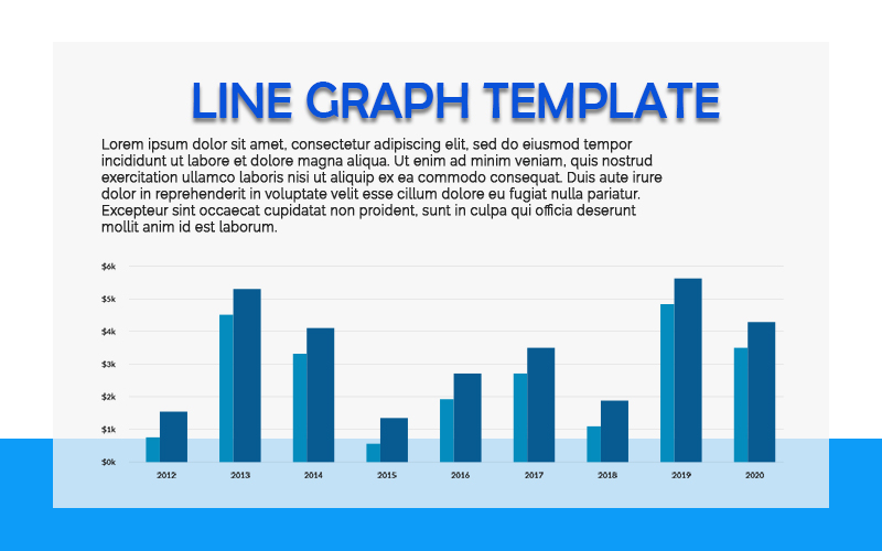
The rate of economic growth of a country is usually present in line graph form. It because the rate of economic growth seen over a more extended period so that the decline and increase will be more visible with the line graph.
- Population Growth Rate
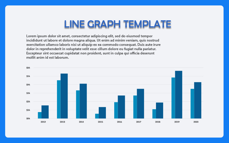
As the rate of economic growth, the price of population growth presented in the form of a line graph template.
- Population Data
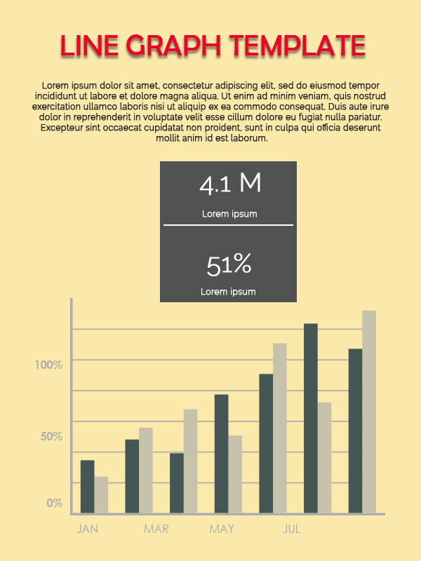
Like the current situation where the COVID-19 virus has spread throughout the world, the number of patients can present with a line graph. It is to determine whether the trend is up or down.
- Value Changes Over Time
The line graph is also appropriate for showing changes in value based on a specific period. For example, the difference in magnetic field values during the years 1900-2000.
How To Create a Line Graph Template?
You can make a line graph in Microsoft Office like Word or Excel. Besides that, you can also make it on Google Sheet automatically. To make a line graph, you can access it on the Insert menu, then in the Illustrations category, choose Chart. Then your data will automatically be presented in line graph form. If creating in Word, you have to write data manually after selecting the line graph. But if you build it in Excel, block the data in question, select the Insert menu, select the Chart, and select the line graph with the design you want.

The data presented in the line graph search for the trend using Excel to find out the pattern of the graph going up or down. You can adjust the line graph display such as title, line description, period, and line shape. You can also choose the data displayed in the line graph if there are not too many.
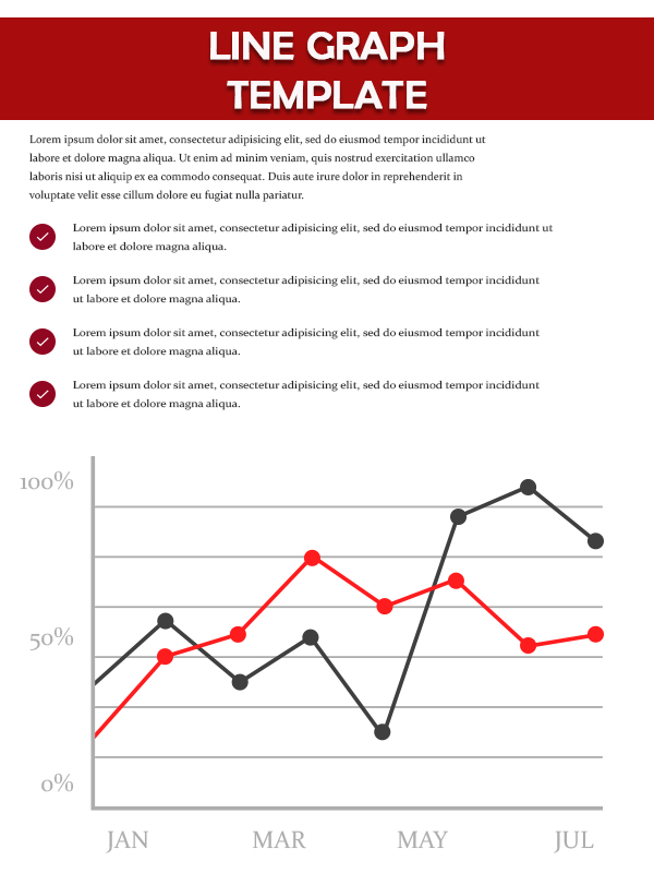
line graph Design Ideas
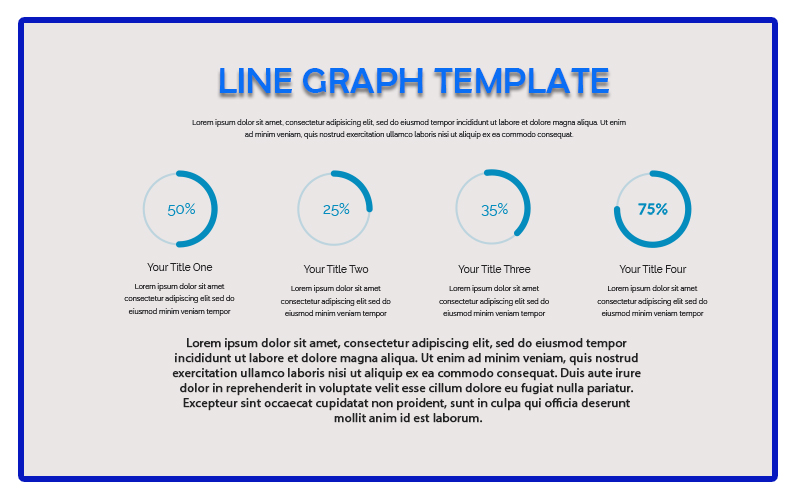
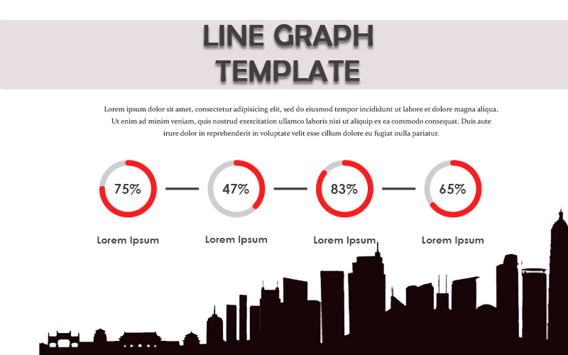
line graph Ideas
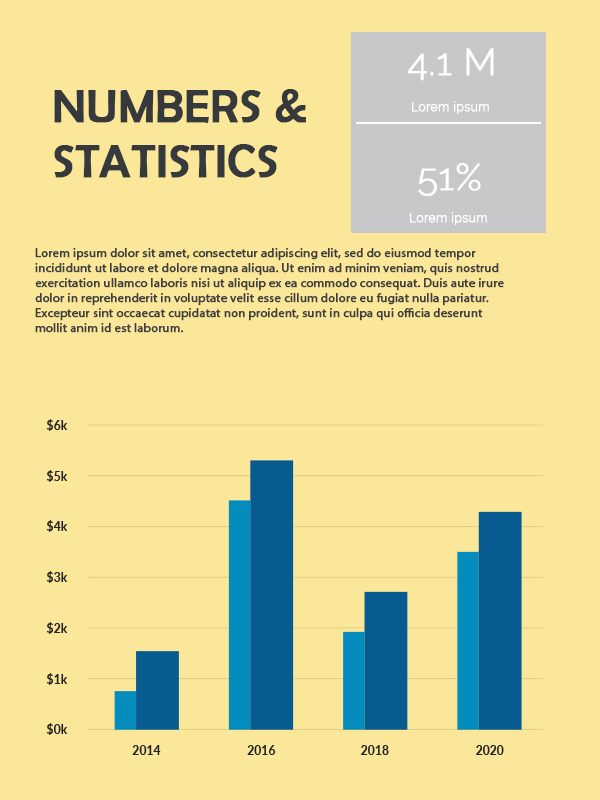
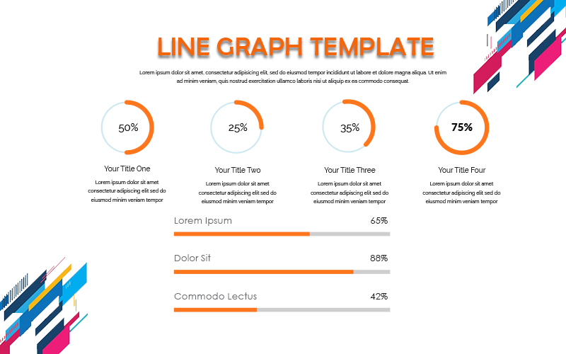
You can adjust the line graph template as effectively as possible. Includes color selection, line thickness, and X-Y axis to clarify data. Visual information in line graphs can represent millions of data in the form of numbers, making it easier to understand.


