Sales Flyers Template and Tips to Design Your Flyers Like a Pro
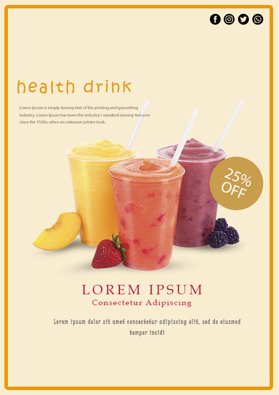
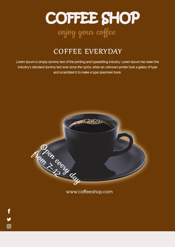
Flyers are used by new businesses or existing ones as promotional tools. Sales flyers need to be eye-catching so that it can perform its main function which is to attract attention. To do that, you must get creative when it comes to designing the flyers. If you are not confident with your designing skill, you can get the sales flyers template with the work.
Contents
What are the purposes of the sales flyer?
Even in this digital era, the use of printable promotional tools like flyers is still popular for its ability to reach targeted audiences effectively. The freedom to choose sizes and printing options will help you easily adjust the budget for promotion.
- Printable Monthly Planner 2018
- Daily Chore Charts Printable
- Printable Letter Head
- Grid Paper Free Printable
- Printable Blanks
The main purpose of a flyer is to attract people’s attention. But it does not stop there, flyers should also be able to make sales through offers or event details. To design a sales flyer, not only should it look good but also fulfill those purposes. You can start by getting the sales flyers template and then adjust the information inside it.
Tips to design sales flyers
I’m sure you get it, that your sales flyers should look great and stand out, but how to do it is the real issue. No need to worry, these tips will help you to design a sales flyer template like a pro, even when you are no designer.
- Function first
Don’t get distracted by accessory stuff for the design, you need to put the function before all that. make sure the information in the flyer is concise and clear.
- Play with grid
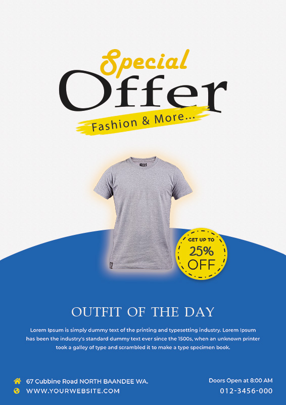
For a small space in a flyer to contain maximum information, we will need to do something about that. well, a balanced grid can make the small flyer look less cluttered even with much information packed inside it.
- Less is more
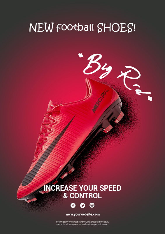
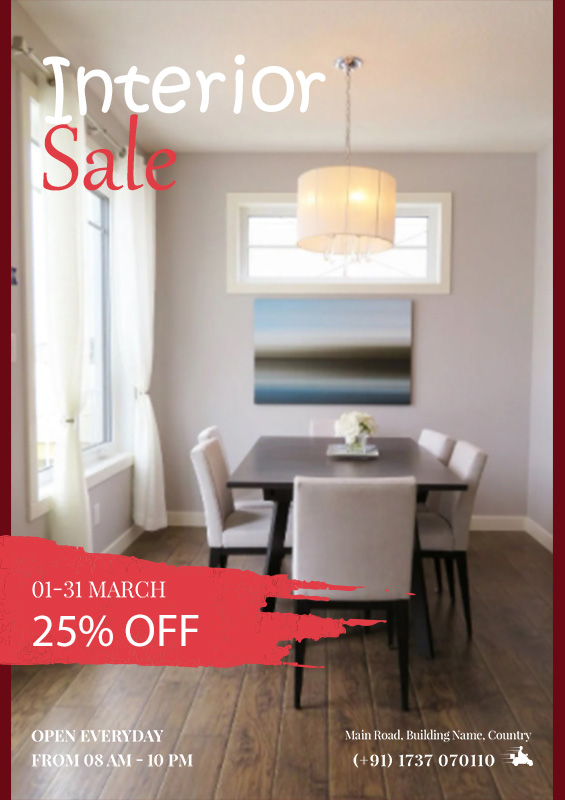
If your goal is to attract corporate or more intelligent consumers, the use of minimal and calm design is much more preferred. Black and white or grayish color with a hint of brighter or one bold color will do well.
- Play with colors
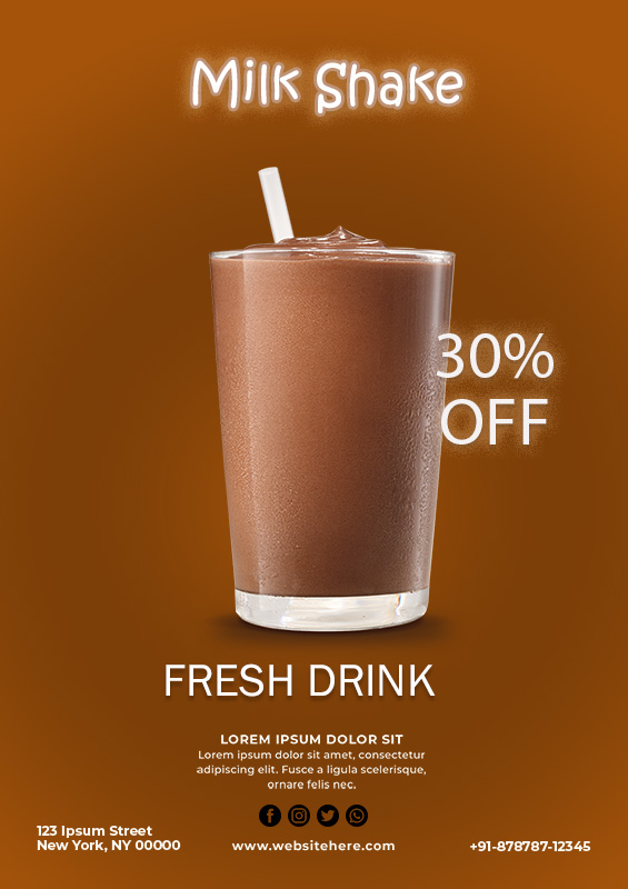
What your flyer looks like is depending on what you advertise. Experiment with brighter colors and bolder design if you advertise something informal such as a festival.

- Available online
Though flyers are printed products, it is better to make it available online. Nowadays more consumers are going online when they interact with brands, so you don’t want to go unseen, right?
When you are designing flyers, you should look first at what you are offering and who you are offering it to, that way you will be able to come up with the right design.
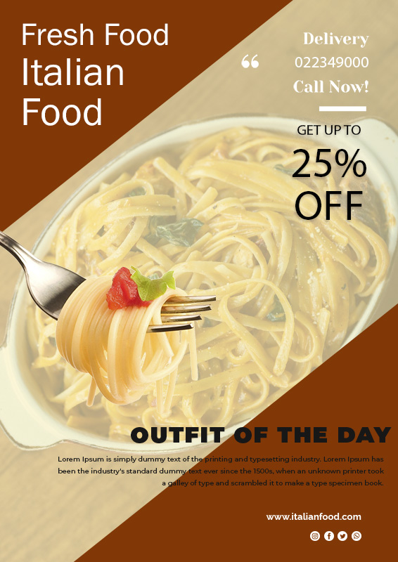
sales flyers Design Ideas


sales flyers Ideas
